Turks & Caicos
Challenge
Experience Turks & Caicos, a division of the Ministry of Tourism, needed help to redesign their website—and potentially their brand identity—to better attract and engage prospective visitors.
Approach
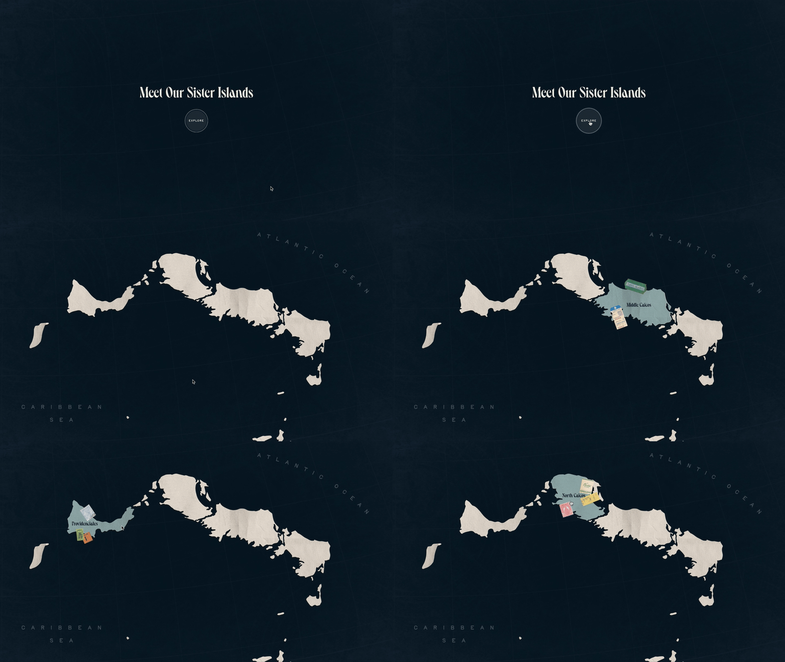
Created a "quick" visual identity and explored how would that identity look on a website. I aimed to attract a younger audience with a website that balanced nostalgic charm and modern usability—informative, yet memorable. I really enjoyed designing retro-inspired stamps, stickers, and matchbooks, and blending them with a fluid, contemporary layout. Out of the three directions pitched by Haus, mine was one of them—and together, they helped us win the project.


002


